Athletics Branding
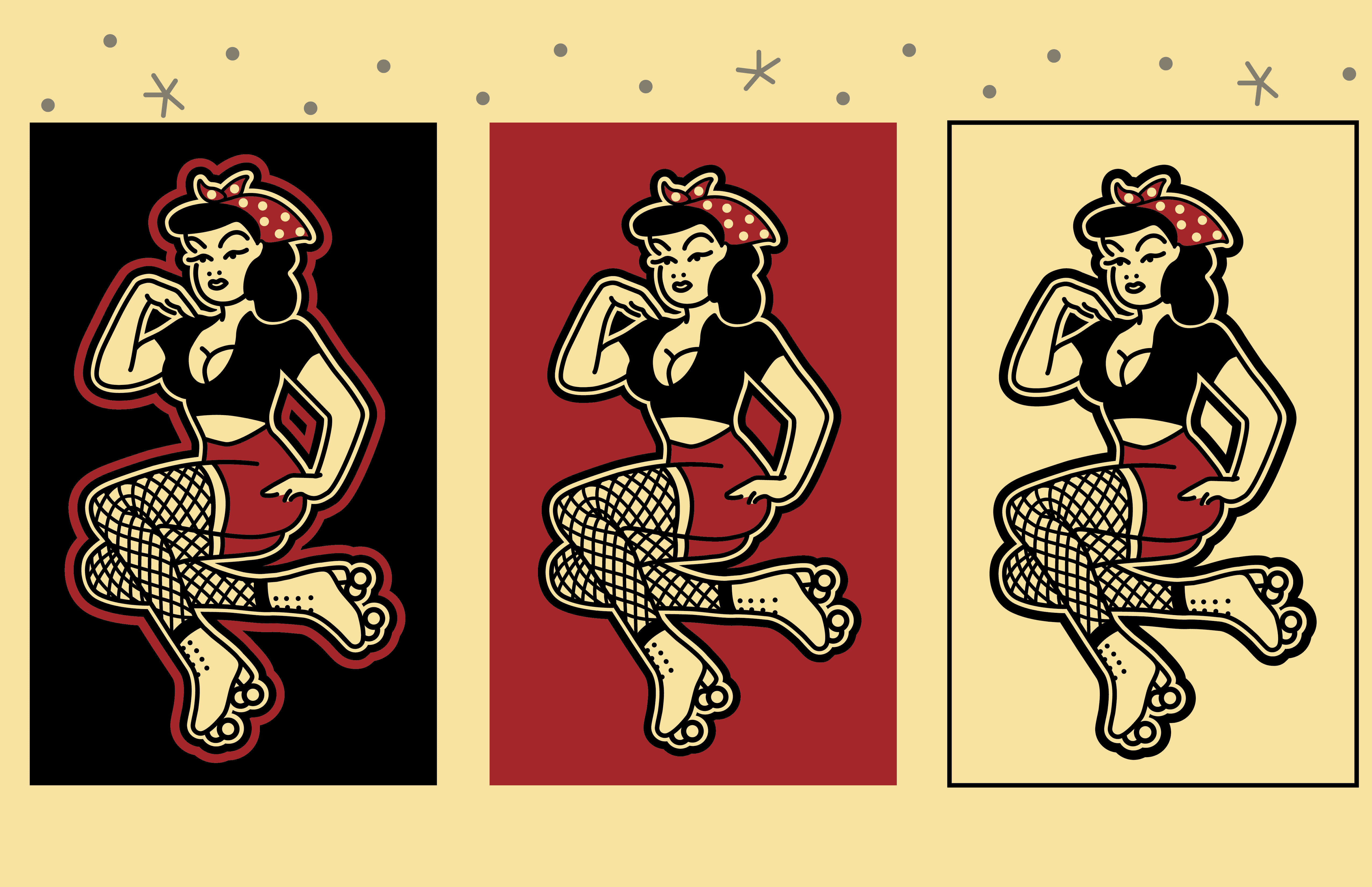
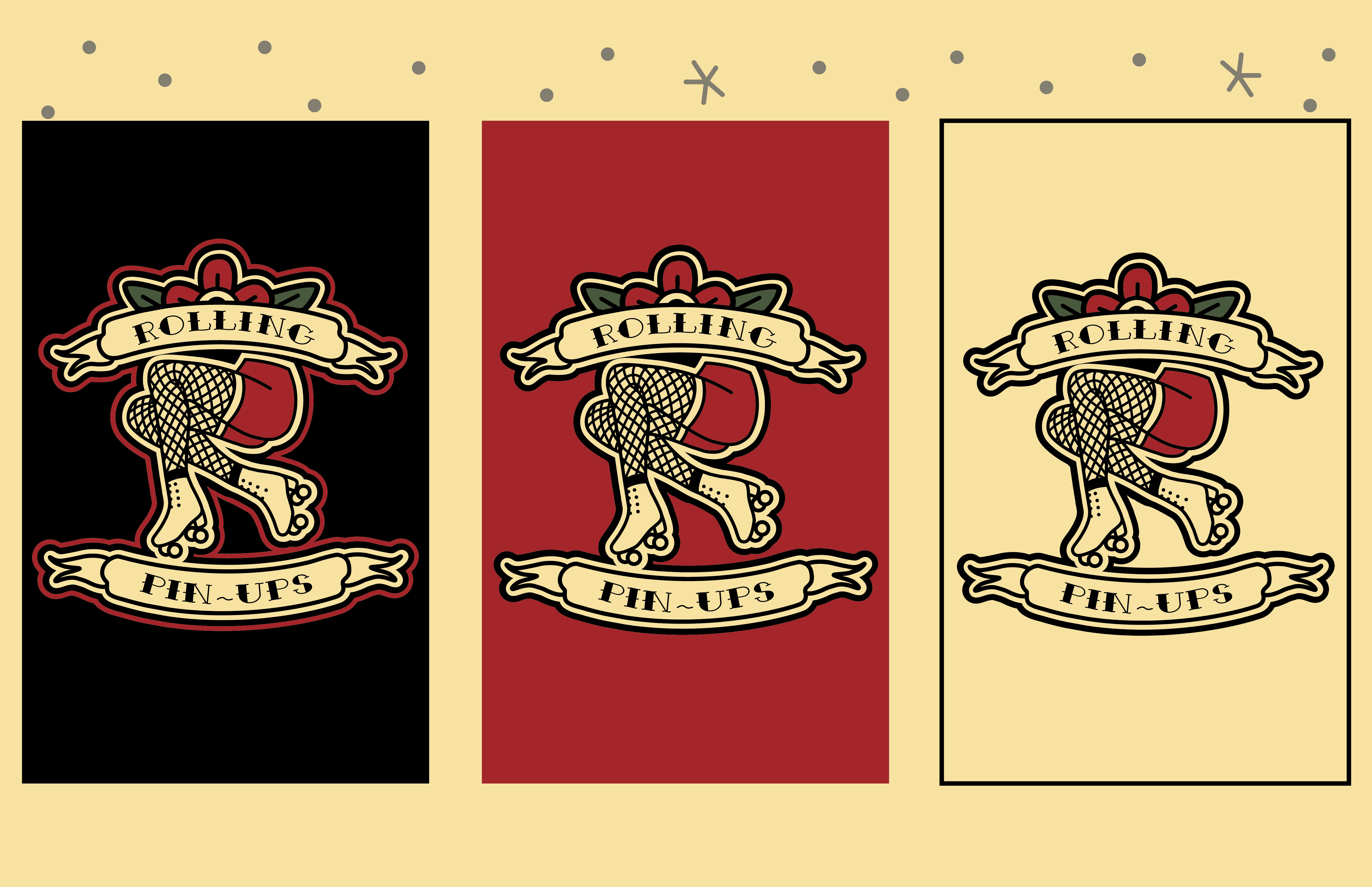
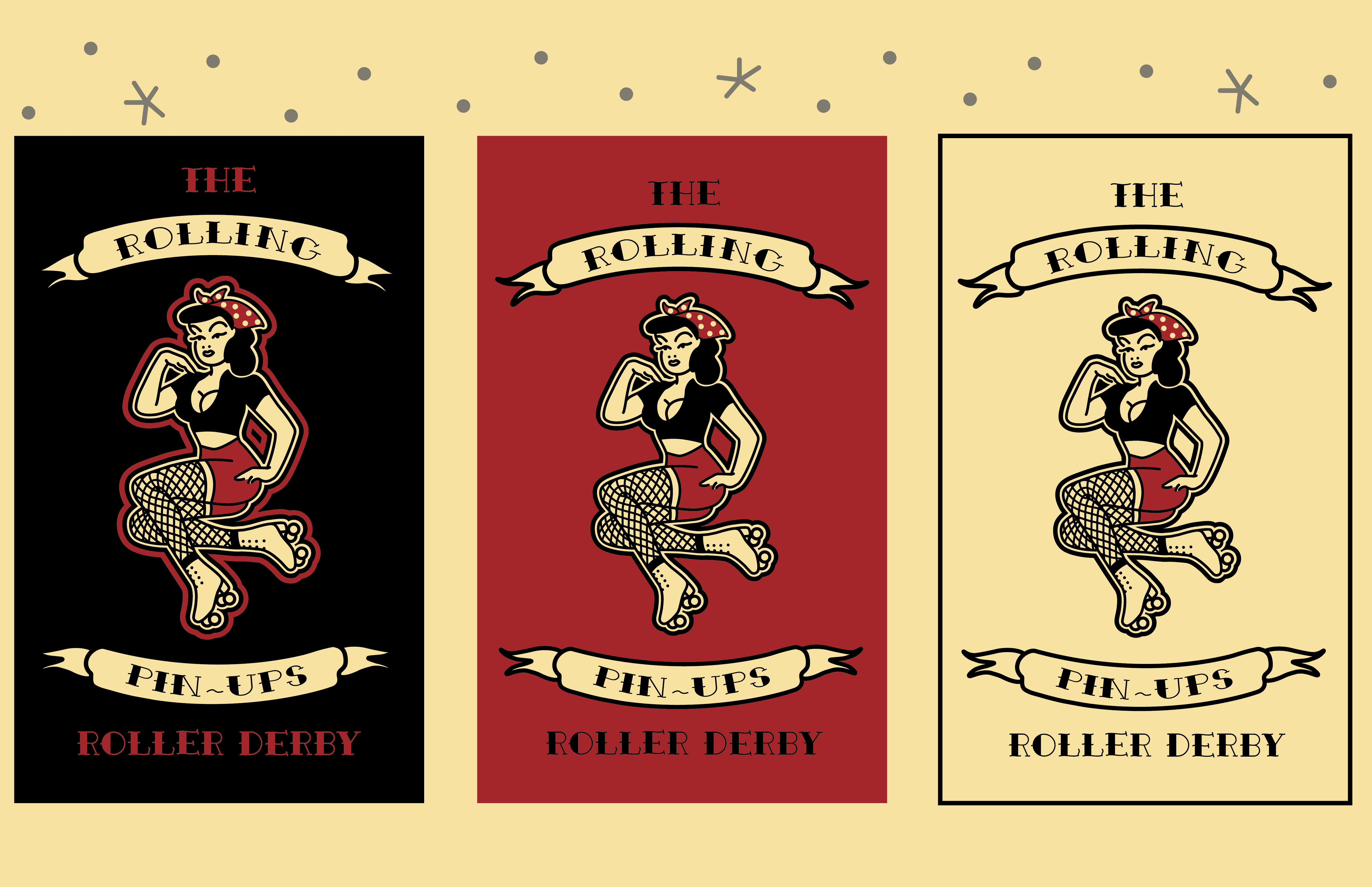
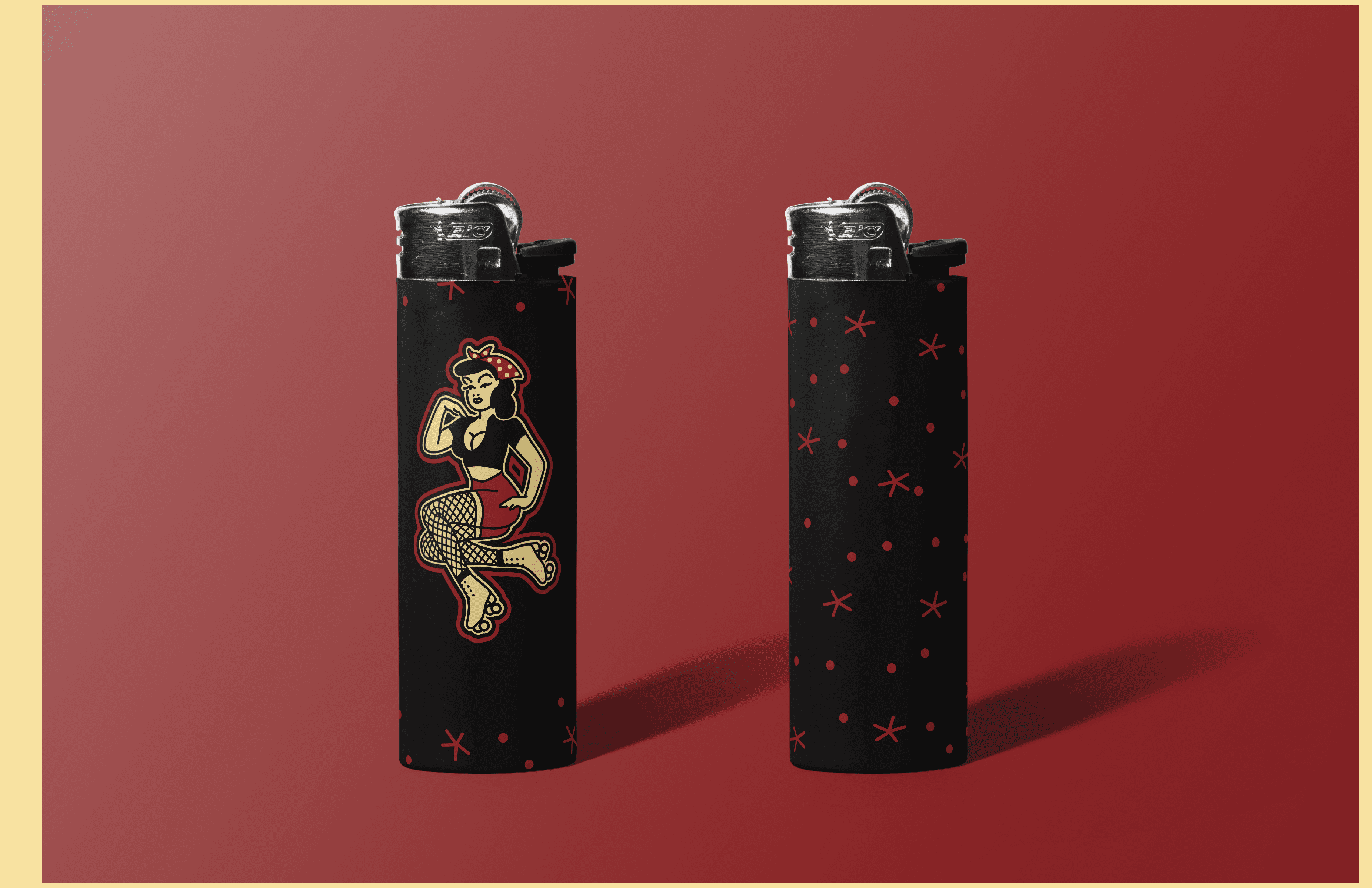
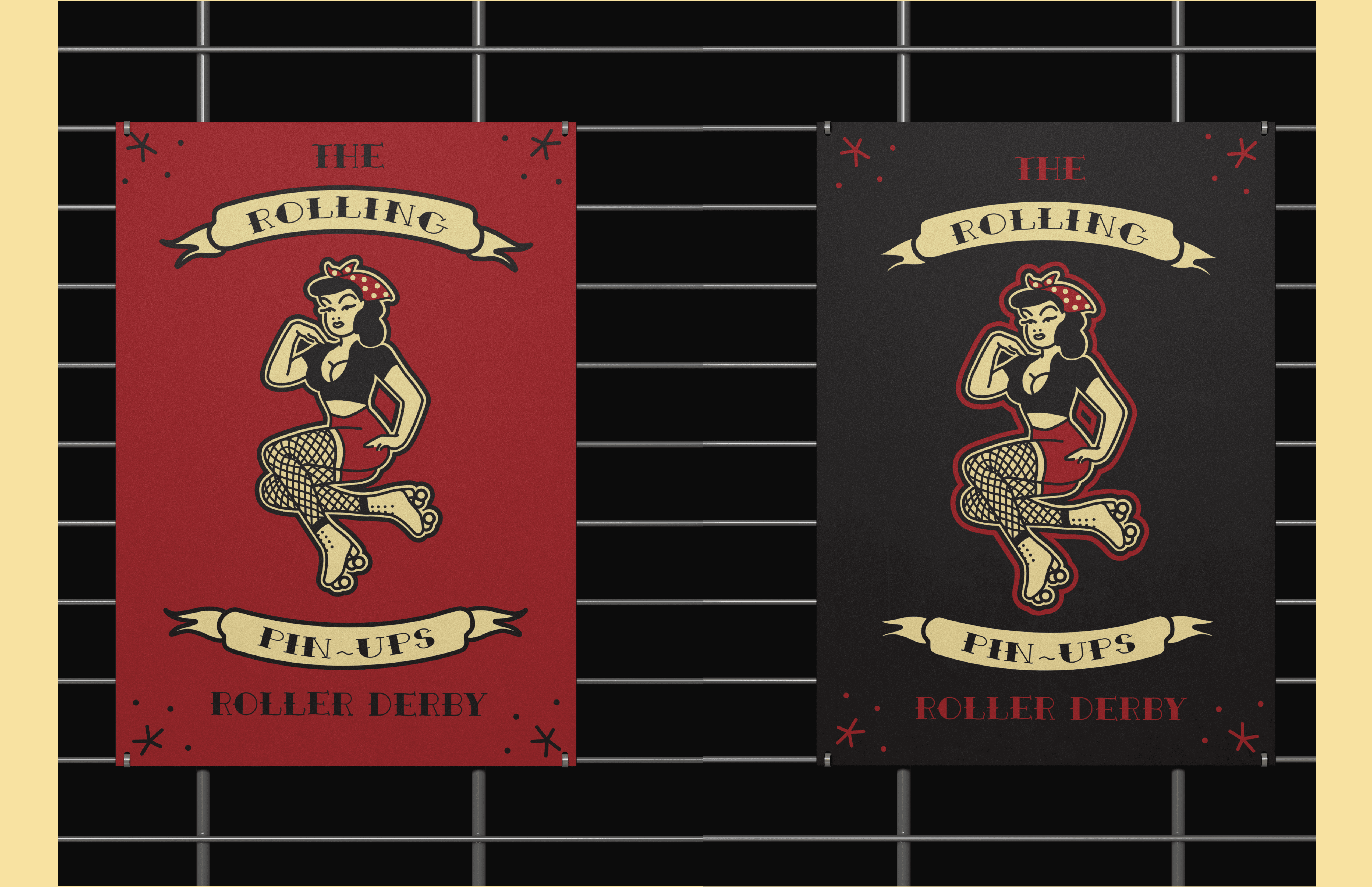
Rolling Pinups Athletics is a brand identity for a regional non-profit roller derby team that captures the energy, grit, and community of the sport through illustration and a central mascot system.
00

problem
The problem was to update the old team branding to develop a visual system that feels new, bold, and culturally aware while remaining accessible and functional for a volunteer-run organization. Mainstream sports branding is heavily dominated by professional men’s athletics, leaving alternative, community-driven leagues underrepresented. Roller derby is a woman-organized sport rooted in inclusivity, DIY culture, and third-wave feminist values that offer a rich opportunity for more expressive and subversive visual storytelling. This project explores how graphic design can create a cohesive identity for a regional, non-profit roller derby league that embraces the sport’s signature contrasts: femme-coded aesthetics paired with aggression, humor, and physical strength. Drawing from punk, pinup, and satirical wordplay.
solution
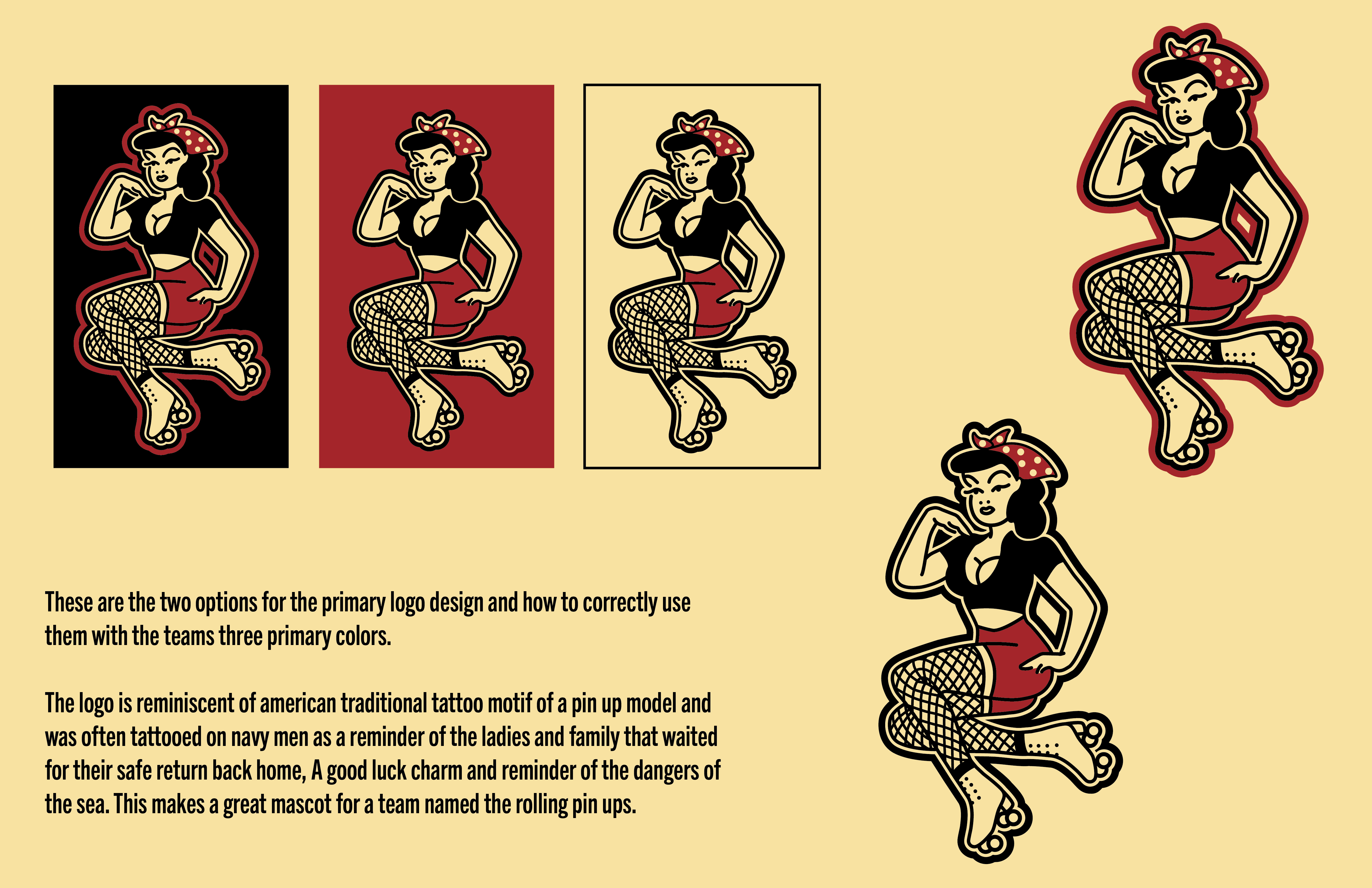
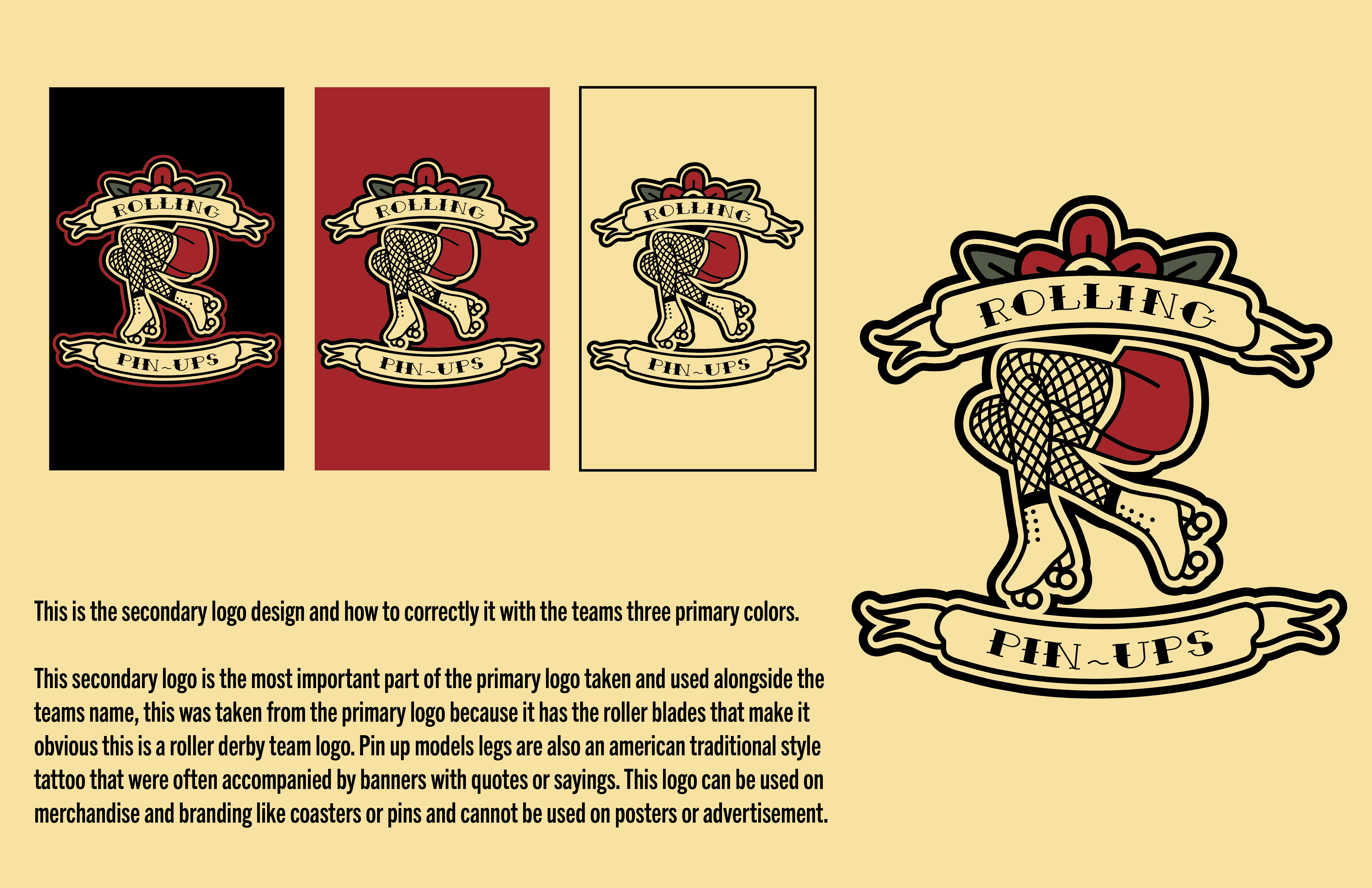
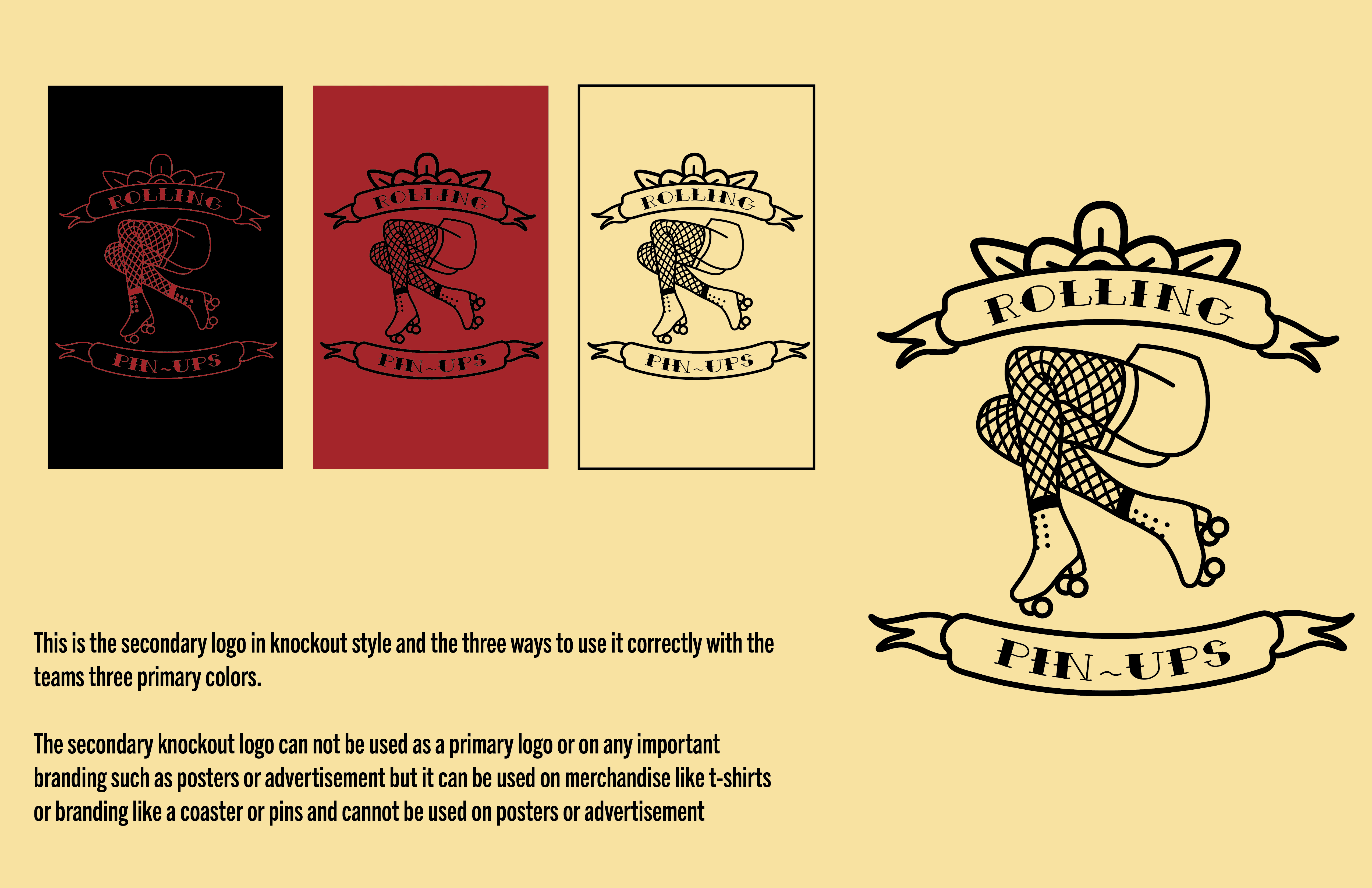
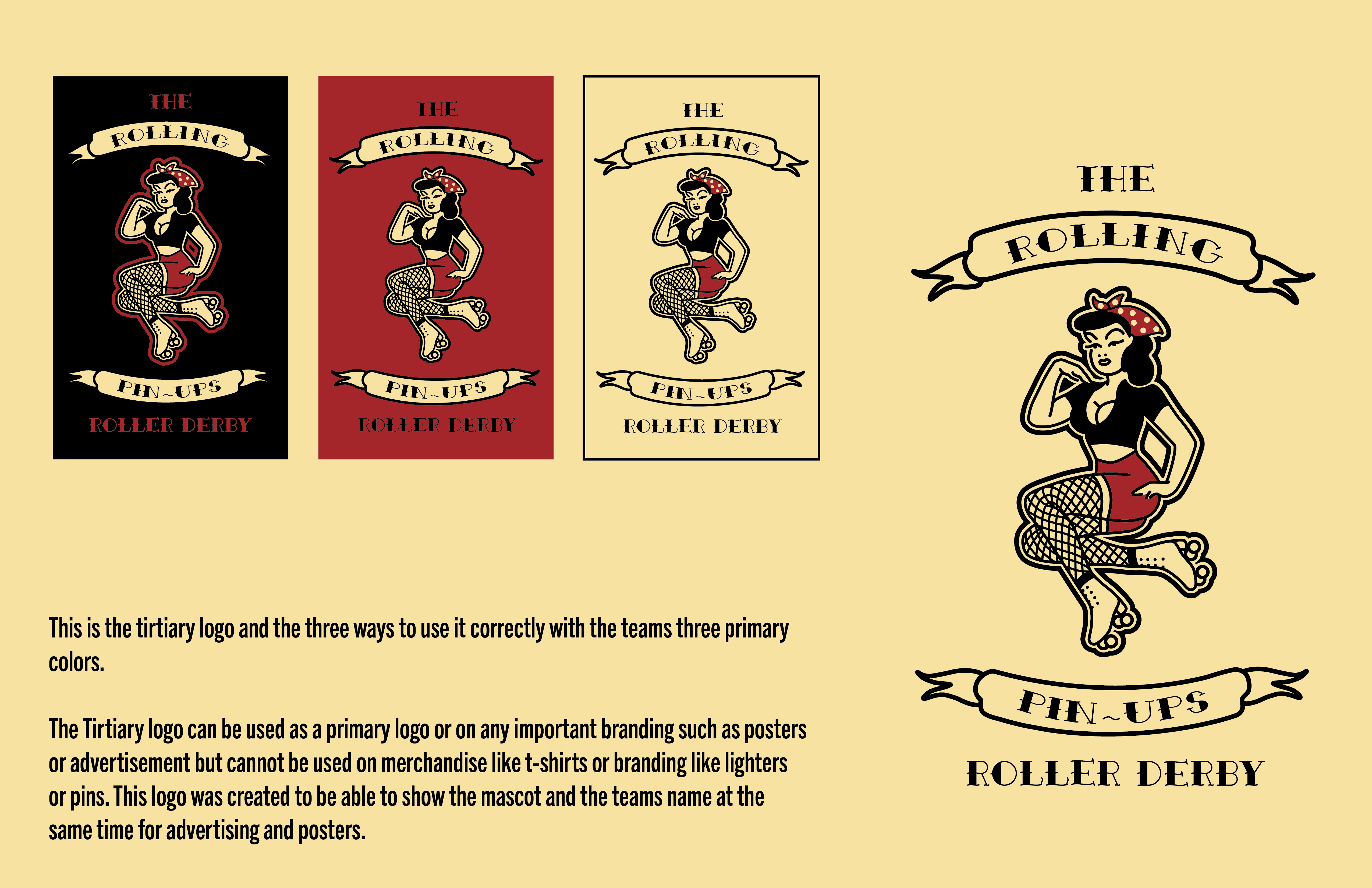
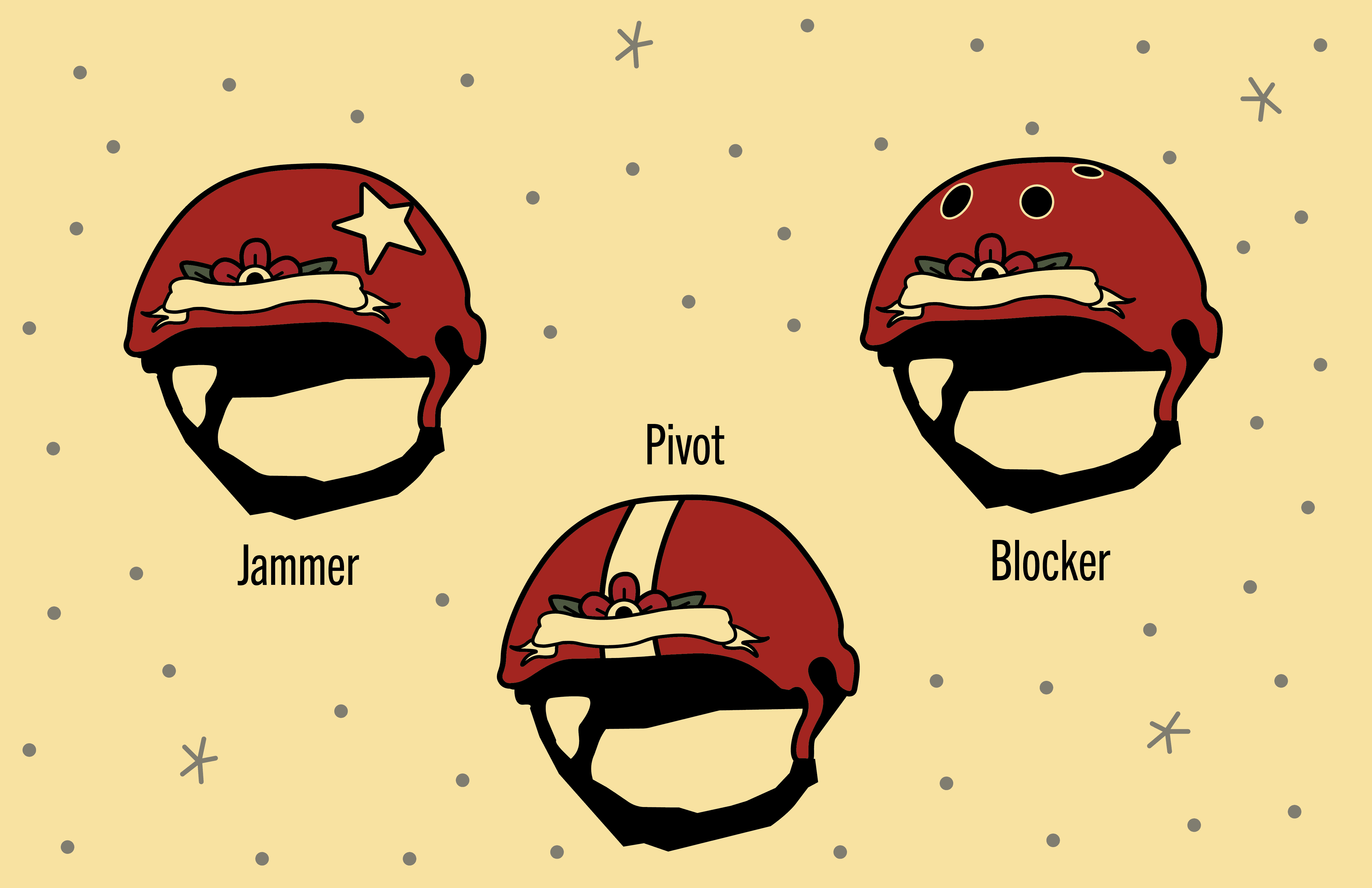
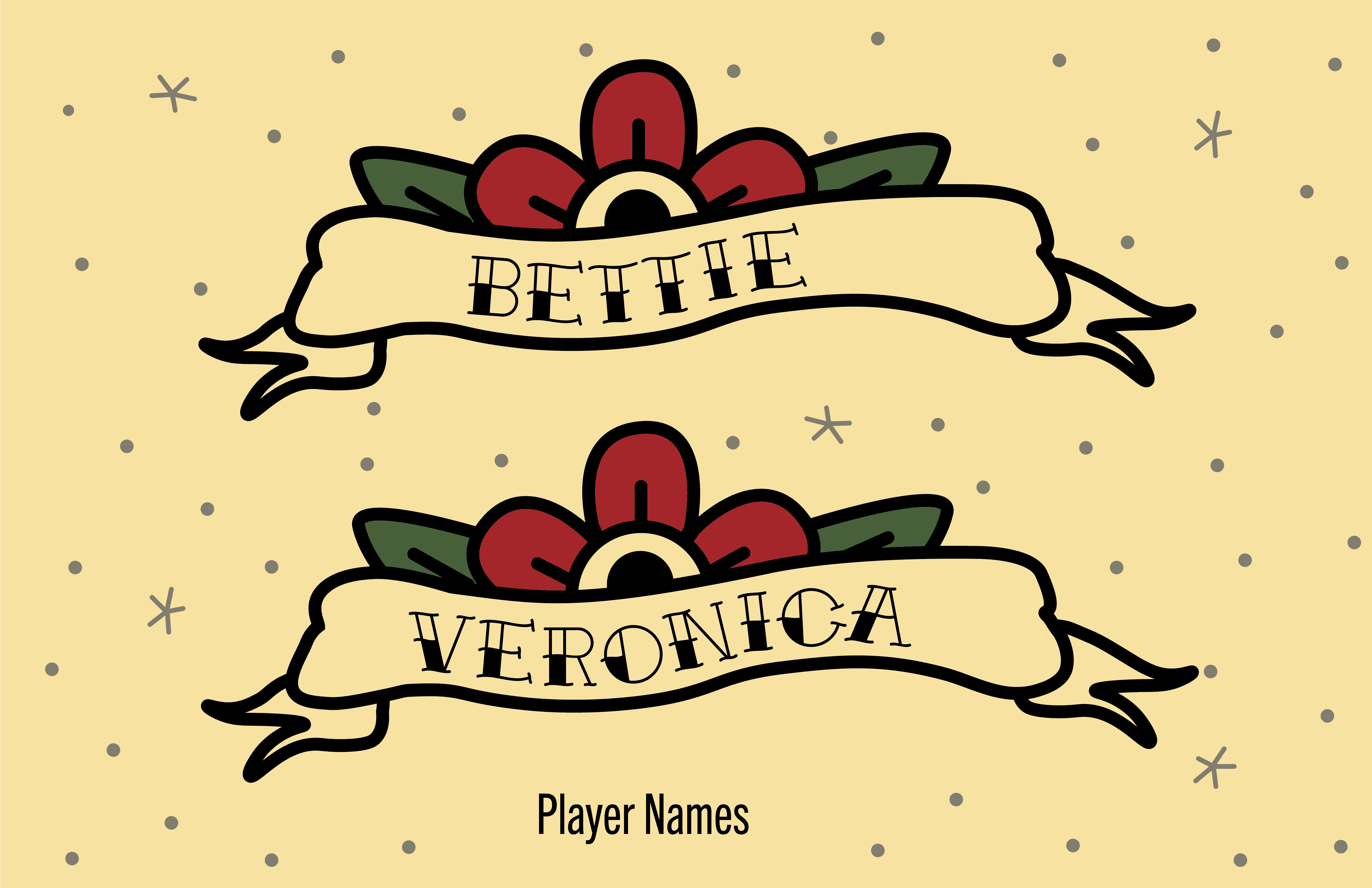
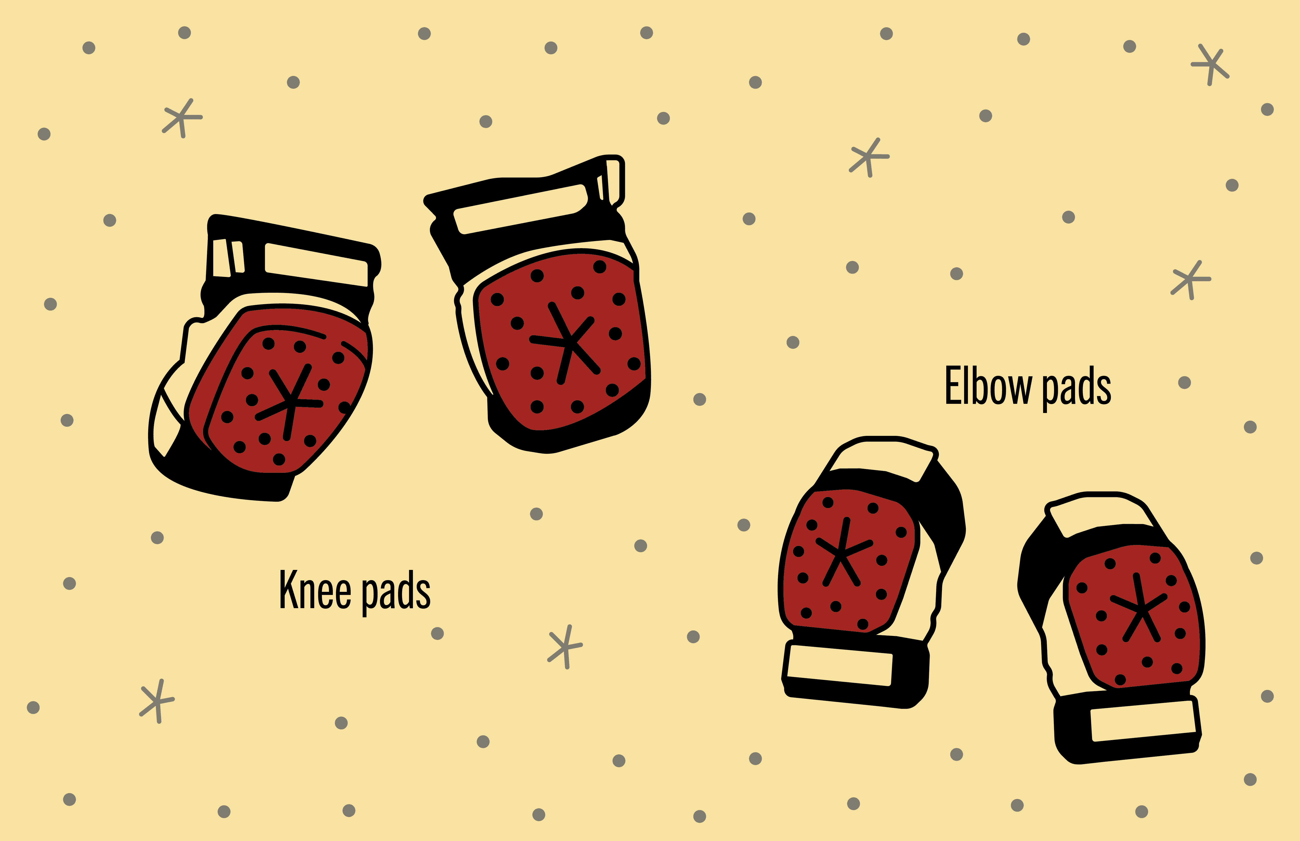
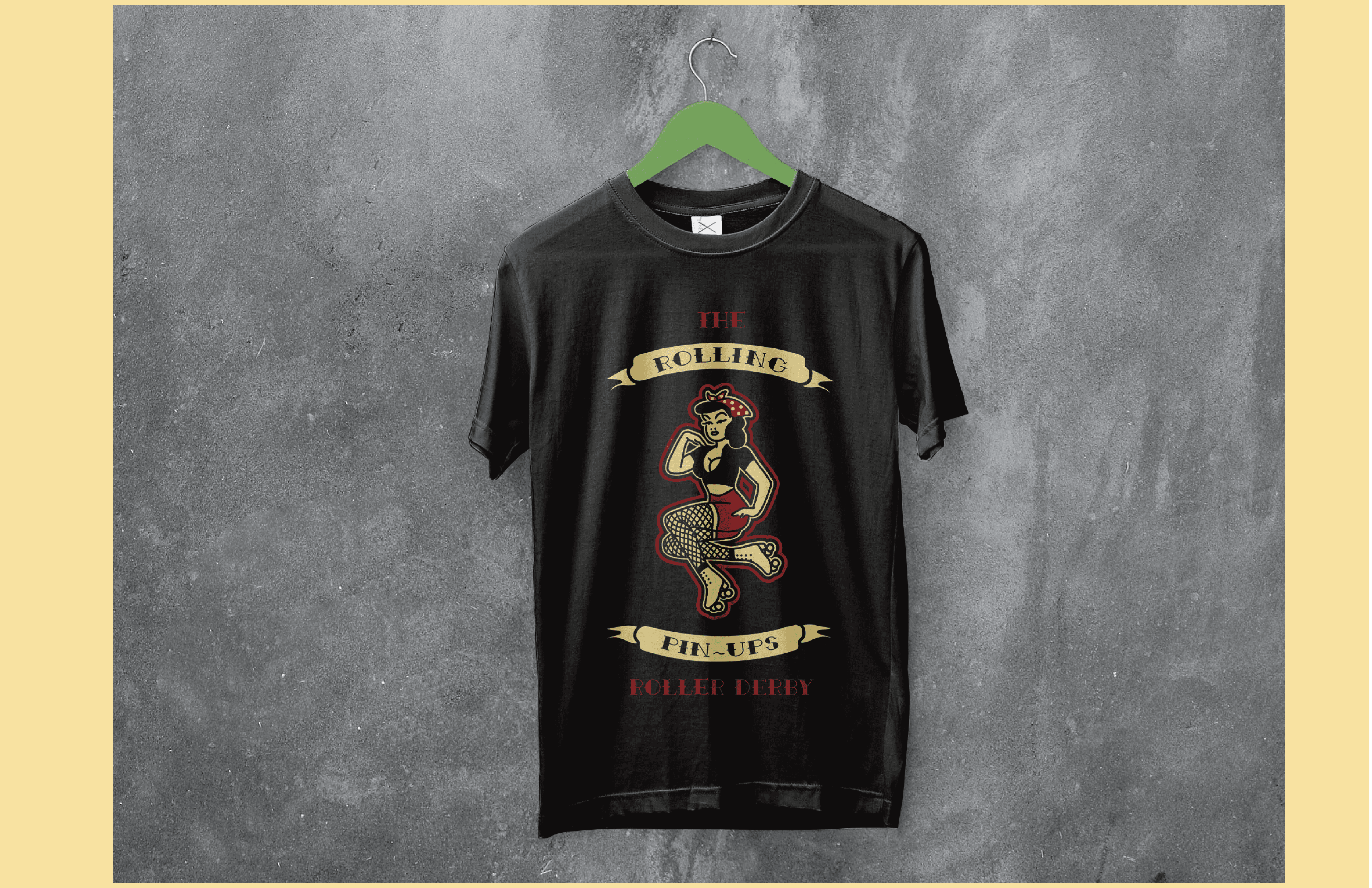
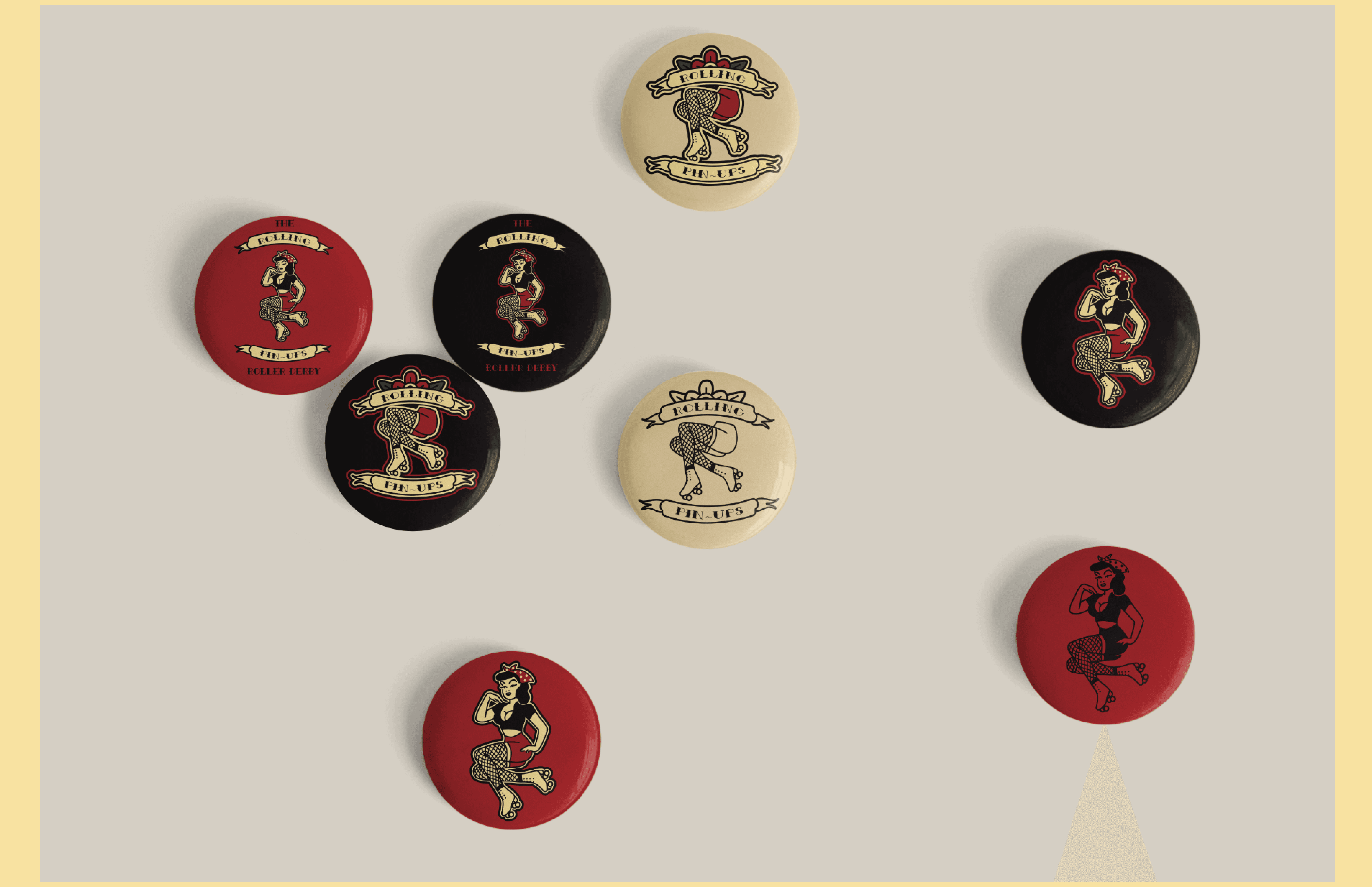
My solution was to build a bold, illustration-forward visual identity that celebrates roller derby’s subversive spirit and community-driven roots. The system uses meaningful typography, playful wordplay, and graphic elements that juxtapose femme-coded imagery with aggressive forms to reflect the sport’s humor, strength, and inclusivity. Designed to be flexible and easy to deploy, the identity supports everything from posters to merchandise while giving the league a recognizable, confident presence that stands apart from mainstream sports branding.
year
2023
timeframe
1 month
tools
Illustrator, Photoshop
category
Branding and Identity


